It's been much too long since I put a blog post up, but it seems that's the way life is right now :).
Quite a bit has gone on here in the rabbits.
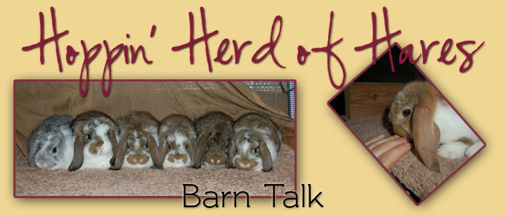
The biggest announcement is that the whole site has been completely redesigned. Our internet was out last week for a few days, so I took the time to finish up my new site design. I'm pretty happy with how it turned out :). There's just a few things I have to finish up on the site, but most of it is good to go. You can view it here.
And in that process, I took new pictures of just about everyone and put them up on the site.
Diamond's babies growing and getting big. She has several chestnut agoutis and a couple black chinchillas.
Unfortunately, her little charlie has no nose markings. It's the first charlie I've had born here that hasn't been showable, from what I can remember for probably about 7 years. My charlies always have a full butterfly. But, not with this little guy. Oh well, he sure is cute :)!
Kayla's babies are all doing really well too and getting big! I have to sex her babies and get pictures of them soon.
Melinda's babies are 5 1/2 weeks old now, so I just went through her litter to pose them all up. You can see them here. They are a promising bunch of babies! I like all of them, although her little chin buck could use some improvement.
I'm keeping one of Melinda's two broken chestnut does. She's so adorable :)!
Also, there are several babies on the for sale page on the site, as we have a few left available out of our last batch of babies.
That's the quick updates for now...more later, Lord willng!


2 comments:
Your site it lovely as always!
I really like the look of your website. It’s very clean and simple. The simplicity of the website ensures that the focus is on the bunnies. Not overloading the website with designs and graphics definitely works to your advantage, at least from a business standpoint. Also, putting the navigation on the left side was a smart thing to do because the contents are much easier to read that way.
-- Darryl Tay
Post a Comment